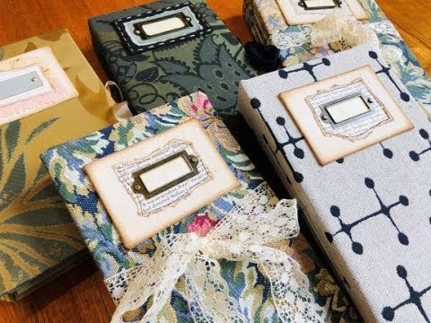
If you make junk journals and you've been looking for a finished hardcover design to sell or gift — one that's sturdy, thoughtfully constructed, and ready for someone else to embellish — this flip-through is worth your time. I'm showing a completed series of five hardcover naked journals, all covered in upholstery fabric, all built to the same internal structure, with enough variation between them that each one feels its own.
What we cover
A flip-through of five completed hardcover journals covered in upholstery fabric, each measuring approximately 5½ × 8¾ inches with a 1.5-inch spine. I walk through the internal anatomy — pockets, envelopes, tea-dyed pages, acetate dashboards — and show the small differences between journals: fabric pattern placement, closure styles, and where I tucked envelopes when the front pocket ran too narrow.
What you'll learn
How the internal structure of a naked junk journal is laid out, including:
- A front acetate dashboard page that protects the opening spread and doubles as a surface for sticky notes or decoration
- Two paper bag signatures that create four pockets, plus a fifth separate pocket at the front
- A handmade envelope — embossed and coffee-dyed — placed in whichever pocket it actually fits
- An envelope sewn directly into the cover at the midpoint for easy, always-there access
- Tea-dyed pages left completely unembellished, ready for the person using the journal to add their own layers
Why I call these "naked journals" — the tea-dyed pages have no sewing, no embellishments, nothing added. That's intentional. A lot of people want a beautiful, ready-made book they can fill and decorate in their own way. Leaving the pages bare is part of the offering, not an unfinished step.
How the hardcover construction allows the book to lay flat — I built these covers myself rather than wrapping a ready-made book in fabric. The key is spacing in the hinges. Getting that right during construction is what lets the book open flat without fighting you.
How upholstery fabric behaves differently from standard cover materials — it's durable and beautiful, but it's also thick and structured in a way that affects how you work with it. I wrapped it around a self-constructed cover rather than using it as a soft wrap, which changes the whole character of the finished journal.
How fabric placement changes the look of identical journals — the last two journals in this series use the same floral upholstery fabric but look noticeably different from each other because of where I cut the pattern. One has a centered flower on the front; the other doesn't. Worth thinking about when you're working with patterned upholstery fabric.
How closure styles can be the primary variation in a journal series, including:
- Ribbon closure sewn into the inside of the back cover
- Lace wrapped around the book — fully removable or tucked under the binding to stay in place permanently
- Gold thread used to make a bookplate legible on a very dark (black and green) fabric cover
Tips & gotchas
The spacing in the hinges matters more than it might seem during construction. When I built these covers, I was deliberate about leaving the right gap in the hinge so the finished book could open and lay flat. Skip that step or rush it, and you end up with a beautiful cover that fights the reader every time they try to use it.
Envelopes and pockets don't always cooperate. The front pocket on some of these journals was too narrow for the coffee-dyed envelope to sit in comfortably — so I moved it to the first usable pocket instead. It's not a flaw, it's just practical. If the envelope fits better elsewhere, put it there. The journal still has the same contents; they're just arranged to work rather than to match a diagram.
Sewing the envelope into the cover at the midpoint does two things at once: it gives you somewhere permanent and immediately findable to tuck a card or note, and it also adds a structural anchor in the centre of the binding. Without it, the spine felt like it needed a third element there. Once I added it, the whole thing sat better — visually and physically.
For very dark fabric covers, standard bookplates can disappear entirely. The black-and-green journal in this series needed gold thread to make the bookplate readable. It's a small detail, but it's the difference between a design element that reads and one that vanishes.
A consistent internal structure with the same pocket count, page count, and envelope placement means each journal is genuinely equivalent, even when the fabric and closures vary. What changes is the cover, the closure, and the scrapbook paper at the front — and that's enough to make each one feel individual without rebuilding the whole thing from scratch each time. If you make for sale or for gifting, that kind of repeatable internal structure is worth developing for your own work.


