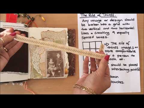
If you've wanted to try collage in your junk journal but weren't quite sure where to start — or you've glued things down and felt like something was off but couldn't name why — this tutorial is a good place to begin. I made this page working through some basic collage principles I'd been researching: rule of thirds, focal point placement, cohesive color, and how to build up layers without overwhelming the spread. I'm not a collage expert — honestly, it's been one of my weakest skills — so this is me learning out loud and sharing what I found.
What we cover
We build a complete collage page in a junk journal from scratch, starting with a torn book-page background and working up through layers of doily, ephemera, die-cuts, and a stamped paper element. Along the way I walk through the core principles I researched — rule of thirds, focal point placement, color cohesion, and layering order — and show how to apply them on an actual page rather than just talk about them in theory.
What you'll learn
How to build a collage background using torn book pages — tearing rather than cutting gives you soft, irregular edges that blend into the layers above without competing for attention. Leaving some white space at this stage gives you room to add color later if you want it.
How to apply the rule of thirds to a journal page — dividing the page into a nine-box grid with two vertical and two horizontal lines, and using the intersecting points (rather than the center) to anchor your main element. It's a small shift in placement that makes a page feel noticeably more comfortable to look at.
How to choose and place a focal point, including:
- Keeping it away from the dead center of the page
- Thinking about where the eye lands first and where it travels next
- Using secondary elements like a butterfly die-cut to create visual movement across the page
How to work out your full placement before gluing anything down — laying every element loosely on the page, adjusting angles and positions until the arrangement feels right, and only then committing to glue.
How to build cohesion through a limited color palette — choosing elements that share a color family (in this case, soft vintage tones with touches of yellow) and being deliberate about not introducing colors that don't belong. Turning down a too-bright element by layering it under a doily is one way to keep a strong color from pulling focus.
Why not everything needs inked edges — inking is a habit that's easy to apply to every single piece, but some elements read better when they blend quietly into the background. Letting a phone-book page sit without an inked edge, for example, softens the layer rather than defining it.
How to vary angles to avoid static, grid-like arrangements — straight lines running parallel across a page make a collage feel stiff. Placing elements at slight angles, or shifting a piece off an invisible line it's sharing with another element, creates the visual variety that makes a page interesting.
How to add a sentiment or word element — using book stickers or torn text as a finishing touch, and placing it off-center to avoid a symmetrical, formal look.
How to layer physical elements in the right order — gluing background pieces first, then working forward through the layers so that pieces meant to sit under the doily actually get there before the doily goes down.
Tips & gotchas
Before you glue a single thing, take a photo of your placement. Once you start gluing, the arrangement shifts — pieces move, layers go down in order, and it's easy to forget where something was supposed to sit. Having a photo to reference keeps you honest.
The focal point should not land in the center of the page. It sounds like a small thing but it makes a real difference — the center is where the eye expects to find something, and placing your most important element there flattens the whole composition. Somewhere around one of the rule-of-thirds intersections is almost always better.
Watch for straight lines forming across the page. When multiple elements share the same horizontal or vertical axis, the page starts to feel like a grid rather than a collage. If you notice two things lining up in a way that feels rigid, shift one of them slightly — a small angle change is usually enough.
Not every piece needs inked edges. I have to actively remind myself of this. Inking creates definition, which is great for focal elements you want to stand out — but for background layers and pieces you want to blend in, an inked edge will lift them forward when you actually want them to recede.
If you're thinking about adding watercolor at the end, be cautious. It can be beautiful, but it can't be undone. If you're happy with the page and you're not certain the watercolor will improve it, it's worth waiting — or testing on a scrap piece first to see how your other elements react.
Finally: scale matters. Elements that work in a large journal can overpower a small one. The doily I used here took up more of the page than I'd planned for — in hindsight, moving the focal image slightly to balance that weight would have helped. It's the kind of thing you only notice once it's glued, which is exactly why the placement step is worth taking seriously.
Having the rule of thirds in mind — even imperfectly applied — makes a real difference to how a finished page reads compared to just placing things wherever they fit. Once these basics become second nature, they stop being rules you consciously follow and start being instincts that shape how you reach for the next piece. That's where I'm trying to get to, and this page was a step in that direction.


